I just finished the climax of my story named “You Only Live 18 Times”. As usual, I think it’s my best. It’s probably not, but I always think that when I write something new. It’s in the “Spyjirra” universe and is a Elder Scrolls/Prequel Adventure/James Bond-ish crossover.
But now I have a dilemma. Big spoiler here, but I felt like discussing it anyway. In the climax, one of the main characters is caught underwater nearby a huge underwater explosion. I’d hoped to have her survive, (she’s an argonian and hence can breath underwater) but I just read some interesting and scientific work on underwater explosions and frankly, given the strength of the explosion and her proximity, she really can’t survive.
I’d considered bringing in magic, perhaps a literal Deus-Ex-Machina, or just ignoring actual science and physics, but I talked it over with a friend and now I’m of the opinion that she has to die. It’s a weird thing, thinking that killing a character I’d only just created a few weeks before makes me feel bad. But it does. The scenario was such that she knew she wouldn’t survive, it was a heroic sacrifice, so it would cheapen it to let her live when everything says she can’t.
I suppose it’s just a thing writers have to get through from time to time. It probably is a better story because of it. But… damn.
This is no earth-shaking rant. Just a little thing that bothered me from last week. I live in Georgia, not terribly far from Peachtree City, a team from which made a strong run at the Little League World Series – getting all the way to the national title before losing to a team from Hawaii.
So it’s been in the news here lately. But they said something last week that I at first didn’t think about, but then I started thinking about it and it began to bother me.
The line was something like this – the team from Peachtree City will play a team from Hawaii for the National Title, then will go on to face the winner of S. Korea or Japan for the World series. (S. Korea won against Japan, then losing to the Hawaii team)
Something began nagging at me though when I heard that. I wonder if you can spot it. And again, it’s not really a big deal I suppose, but it annoys me nevertheless.
The winner of the US National title will go on to play the winner of S. Korea vs Japan.
It seems pretty clear to me that this implies that S. Korea and Japan had made it to that spot by playing other international tournaments and winning against the competition, right?
What the hell does this tournament structure look like? At what point did the Hawaii or Georgia teams play against an international opponent? What, does the winner of the US national tournament just get an automatic spot at the very top of the World Series tournament because… what, because we’re the USA?
That just smacks of wrongness to me. Japan’s team and S. Korea’s team apparently played against other NATIONS. Even if they didn’t, they still had to play against each other first, before they got the PRIVILEGE to play against the USA?
To be fair, I’m sure we invented Little League. And even in Pro baseball we call something the World Series that only involves US teams and one (or two?) from Canada. It’s a small World after all. But still, something about that tournament structure still feels wrong to me.
It’s not that I’m anti-US really. But shouldn’t we first have our own tournament THEN begin playing in the international tournament?
Ah, not a big deal. Just seems weird.
I worked out this apparent tournament structure for the Little League World Series based on a Wikipedia list of participating countries. Anyone see any problem here?
This is no earth-shaking rant. Just a little thing that bothered me from last week. I live in Georgia, not terribly far from Peachtree City, a team from which made a strong run at the Little League World Series – getting all the way to the national title before losing to a team from Hawaii.
So it’s been in the news here lately. But they said something last week that I at first didn’t think about, but then I started thinking about it and it began to bother me.
The line was something like this – the team from Peachtree City will play a team from Hawaii for the National Title, then will go on to face the winner of S. Korea or Japan for the World series. (S. Korea won against Japan, then losing to the Hawaii team)
Something began nagging at me though when I heard that. I wonder if you can spot it. And again, it’s not really a big deal I suppose, but it annoys me nevertheless.
The winner of the US National title will go on to play the winner of S. Korea vs Japan.
It seems pretty clear to me that this implies that S. Korea and Japan had made it to that spot by playing other international tournaments and winning against the competition, right?
What the hell does this tournament structure look like? At what point did the Hawaii or Georgia teams play against an international opponent? What, does the winner of the US national tournament just get an automatic spot at the very top of the World Series tournament because… what, because we’re the USA?
That just smacks of wrongness to me. Japan’s team and S. Korea’s team apparently played against other NATIONS. Even if they didn’t, they still had to play against each other first, before they got the PRIVILEGE to play against the USA?
To be fair, I’m sure we invented Little League. And even in Pro baseball we call something the World Series that only involves US teams and one (or two?) from Canada. It’s a small World after all. But still, something about that tournament structure still feels wrong to me.
It’s not that I’m anti-US really. But shouldn’t we first have our own tournament THEN begin playing in the international tournament?
I’m shooting for anesthesiology. I don’t know what major I’m picking yet but it’s either gonna be something biochem or human biology related. That said, art is gonna be less prevalent as my education increases 😦
BUT, I’ll try to max out what I can artwise the early years of my undergraduate education so I don’t miss too much! 😀
What better day to end the year then with a basic guide to colouring- This is for beginners or intermediate artists. Colouring is a big part to an art piece, whether you decide to use colours or not, that’s up to you, but for the most part, having some knowledge on appliance of colour will really help you out!
____________________________________________
ARTISTS WITH AN INSPIRING KNOWLEDGE OF COLOUR APPLICATION! Please take the time to have a look at other artists work so that you ca research and get inspired!
Gullacass:Uses brights, dulls and pastels to create brilliant guro, pop and macabre pieces| DA + TUMBLR
TinyCalcium:Old friend of mine who explores brights and mustard colours and places them as a foundation for their work | TUMBLR
BeastPop:Talented with opposing and Triwheel colours. Outstanding cell-shading, and knows how to flexibly bend colour form to their will in popart. | DA
H0stel:Fantastic composition of light direction and applies colour to bodies based on ambient occlusion. | TUMBLR
_____________________________________________
COLOUR SLANG: I use some strange slang to express colour types and shades as well as groups. Although they may not be canonically correct, I will use these terms to describe colour palates to the best of my ability!
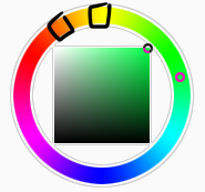
Analogous: Colours that are near or adjacent to each other on the colour wheel, EG: Red and Orange
Oppositional/complimentary: Colours that are opposed or opposite from each other on the colour wheel, EG: Cherry and Green
Triadic: Colours that form a triangle on the Colour wheel, EG: Cyan, Magenta and Yellow. These three colours when mixed together will make black.
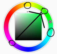
Arrowtype/Quadcolour: Four colours, that generally form an arrow shape on the colour wheel.
Tetradic: Colours that form a rectangle or square in the colour wheel
Neons: The very brightest you can get a colour, be careful where you use them as they can look ugly together at the most. Try to use neons when you are adding bright glowing objects to your piece. Neons are great for highlights.
Brights: Slightly washed Neons. Appropriate if you have characters that are colourful.
Washed: Very washed brights with a hint of grey. These are also useful for colourful characters.
Pastels: Colour with white in them to make them seem light.
Baby Pastel: Pastel with even more white in them, good for subtle highlights.
Darks: Colour with black added to them. Used mostly for lineart.
Mustards: Colours with dark grey added to them
Earthen: Colours with brown added to them
Warm and Cool colours: Warm colours are colours that range fromMagenta to Yellow. Cool ones range from Lime to Fuchsia.
Straight tones: A greyscale palate. or a straight scale of one colour from black to it’s neon form.
Warm and cool tones: Warm tones are a greyscale mixed with warm colours and cool tones are greyscale mixed with cool colours.
Skintones: Warm washed or pastel colours generally used to colour in skin, but they don’t have to be warm at all! ( I will not show you a palate for this however)
______________________________________________
WHAT TO AVOID WHEN COLOURING: beginner artists, tend to go ahead and start by colouring their line art with neon and mustard colours. Neons are not necessarily good for base colours unless the character has a glow.
I often see lazy attempts to shade, often a beginner artist with use an airbrush and use black and white to shade and highlight their piece. This is not very effective, and I’m sorry to say… It’s kind of gross as well. Try to avoid being lazy. If you have a piece that has bold black lines, avoid using soft shading and airbrushing at this point of time.
Black and white isn’t always the best option when colouring in your piece, but it also depends on the style you are trying to convey. If you plan on only using straight tones to colour in a piece, black and white is good.
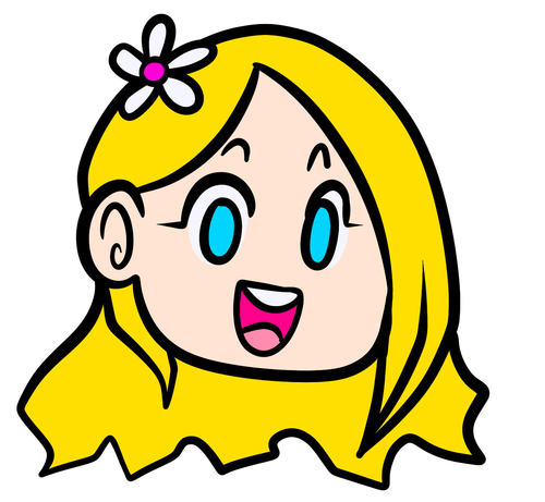
A GOOD BASIC WAY TO COLOUR For this basic tutorial I will show you a nice way to colour in a piece with bold lines. I will be using Minty’s Classic character as an example.
Begin with using brights that have been washed down a little and washed skin tones if your character is human based. Avoid using neons or mustards if you are able. If there is white on the character, such as the white on an eyeball or the teeth, consider using baby pastels. For Minty’s eyeballs I have used a baby pastel blue. I have chosen to use a darker and more washed version for her Irises.
With you foundation colours placed down, use a washed warm colour for the skin tone, such as a salmon. If the character’s hair or fur is warm coloured, use a pink or red orange to shade that as well. Use the cell shading technique. This may mean you will have to erase some of your shading so be sure to do this on another layer. For your baby pastels, you can use a regular pastel to shade it. For Minty’s eyes I have used pastel blue and lowered the opacity by a little.
For Highlights, I have chosen to use baby pastel yellow. I wanted the piece to be warm.
Applying a light airbrush over the top of the piece makes it feel a little softer. I have also applied the airbrush over the initial borders to create colour bleed, giving a very subtle reflective approach.
Colouring your line art layer, particularly if you have bold lines, can really make a piece look more interesting! I like to leave the overall outline black. You can gradient and bleed colour in your line art as well
Light tracing is a technique lots of artist’s use, where they run a sharp line of highlight next to line art to divide borders.
This looks a lot nicer than the black and white shading, doesn’t it!? __________________________________________
This is a very very simple guide to applying colour to your piece! If This helped, please reblog and share this guide around!
If you have any questions or feedback, don’t be afraid to send me a message!
Someone admitted they only recently discovered the difference between a Lotus and a Locust. So I put together this little thing as a reminder, just in case anyone else was under a misunderstanding.
And I realized after I wrote it that the cicada is the original REEEEEEEEE!
…to get the coconuts. Just a Kazerad thing I had nothing to do with but commissioning it and even that was a donation from Caliburr. Is good to have friends, esp. when you’re broke.
I was in Florida on a sort-of vacation visiting one of those friends that you’ve known since you were in grade school, when Kaz had a stream. I jumped in late and he was suggesting semi-lewds. Being in Florida, this came to mind. I might have to come up with a story for it. Or not. Little nekked lizards are always climbing trees down there, so she’s just a little larger than most here.
The “pun” (if you can even call it that) is a stretch at VERY best. Chochi drew it about 2 years ago and even then admitted it’s about the worst pun ever created. I refuse to let it be forgotten and he should be punished and shunned for life for it. 🙂
As for Endtown, I’m aware of it’s existence and someday I might read it, but I really don’t right now. But I do dearly love Chochi’s style SO much! Here’s the original:
So I colored it. I did NOT withstrain my penchant of shiny stuff obviously.
I did make a version with subtle nipple bumps, because I think they’re sexy and kinda cute too, but for a change I’m really not sure it’s an improvement. She’s awfully sexy as-is. I don’t think they make it worse, just… kinda unnecessary.